http://www.artandwriting.org/Ors/Teachers/Students
Go to this link and create an account. You will submit work.
Monday, December 9, 2013
Tuesday, December 3, 2013
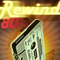
MultiplesMultiplesMultiplesMultiplesMultiplesMultiples
You will use an image of one person in at least four different poses to create an image. There must be a change. The change can be in clothing, height, mood, expression, etc.


Monday, November 18, 2013
Vexels with a 'tude!
A vexel image is an image created using bits, pixels in our case, while it emulates vector images.


The one on the left is the results of a great tutorial, and here is my version.
The difference between the two is that a vector image is drawn using mathematical equations and not pixels. So if I made an image using vector graphics at the size of 4"x4" I could blow that image up to 400"x400" or 4,000"x4,000" without any change in the image--it would look exactly the same! If I make an image in Photoshop at 72 ppi (pixels per inch) at a size of 4"x4" and blow that up to just two or three times that size I would begin to see pixels, and the image would become abstracted.
So a vexel image is not a great image to make if you are printing it large scale, and Adobe Illustrator or some other vector based program should be used. But we are just emulating a vector image to create something , so we are fine.
You must conceive of, design, and then create a vexel portrait with an attitude--it must be dynamic.

Web Sites w/ Great Images
Here is a link to five web sites where you can find amazing historical photographs.

Saturday, November 16, 2013

Sunday, November 10, 2013
Advanced Kids: Funny Character
Use some of the objects in the room to dress up one of your classmates; then do the tutorial linked below:

Beginning Kids: Text Tutorials


Monday, November 4, 2013

Wednesday, October 30, 2013
This is great stuff!
"Photoshop is an extremely versatile application and offers and endless number of ways to accomplish the same task. With so many ways of producing the same effect, it can be difficult for users to understand which technique is the best for the task at hand. In this tutorial, we will explain 10 bad habits that you can break in Photoshop to help you work a bit more efficiently."

Monday, October 28, 2013
Tutorials for this week.
Do three of the tutorials on this page. Make sure to turn the piece into art that is distinctly yours.
http://digitalartanddesign.org/
http://digitalartanddesign.org/
 |
| This kid watched his neighbor make a propaganda piece and fell in love with the work. So he decided to make a piece with his name. Great job, I think. |
Sunday, October 13, 2013
Use text an a graphic...
...to create a pleasing and yet informative message. You are to do one of the following:

make graffiti on a wall
put a disclaimers on a shipping crate
create a cautionary diagram on street a sign or instruction manuals.
put a disclaimers on a shipping crate
create a cautionary diagram on street a sign or instruction manuals.
Context matters!
Remember that you should do something that you have an emotional attachment. That is, if you don't care about dogs then don't make something about dogs. You should love or hate your subject matter.
Also, consider how you will deliver your message should be delivered to your audience. Where would your audience be most likely to see it?

They've seen the light!
Yeah, my kids are just great. This piece was done by an Honors kid who is doing amazing work this year. I wish I could have had her one more year so that she could do AP, but she needs to move on to college. Where ever she goes that place will be better for having her!

Tuesday, September 24, 2013
bust male sculpting clay ceramic
We will use this method, but we will fill the body with newspaper first.
Thursday, September 19, 2013
Kids work!
It is great to watch a kid's work as she puts the ideas and together and begins to construct the piece. I'd love to feature all of my kids' work, but that will be impossible. So check out the links on the right to see each kids work.
Saturday, September 14, 2013
Workin' away!

As usual, I'm amazed by what the kids come up with.
In this one, Alex found an artist, Eugene Soloviev, with whose work he became smitten. "I really enjoyed making this piece because Soloviev's style really appeals to me. The idea behind Soloviev's pieces is that he takes two things that don't belong together and put them in a "different" background. In my piece I took a tiger and a house cat and put them underwater to portray a cat's distaste for water. Furthermore, it's sort of ironic that the tiger is chasing a house cat. I had a slow start to this piece, but I am pleased with how it turned out." Alex
Sunday, September 8, 2013
Pickle Boy
This is a beginning tutorial that the graphics kids will do. I had some fun putting it into context, and I learned a new trick, which I always love. I cannot wait to see the kids' efforts.

Thursday, August 29, 2013
And we begin!
 I'm having the sculpture kids blog this year, too. And I plan on using this blog to communicate and post information, so I hope that it is even more lively with kids' art and thoughts.
This is what we've been working on in sculpture. The kids are drawing cubes and shapes and rotating them on the 2D surface. As a school we're now a 1:1 iPad campus. So I've had the kids drawing in Notability, which is lovely and fine and works. But I offered the use of a traditional sketchbook, and everyone in one of my classes took one. Go figure. So they'll still use the iPads for research, music, communicating thoughts and ideas through social media and emails, and anything else we can think of.
Here we go!
Sunday, August 25, 2013
Tuesday, May 28, 2013
The end of this year!

Summer is here!
Monday, May 13, 2013
Super Heroes project results.
There were some really nice pieces that the kids made for the Super Hero project. It is really refreshing to see them come up with their ideas!


There are so many reasons this is great!
This kid made a year out of making art that included his image and heritage.

And this kid had too much fun and included social commentary.
Saturday, May 4, 2013
Winding down.
It is hard to believe that the year is at its end. The seniors have about a week left--although some have already checked out. The rest of the kids can feel it, too. Even so, they are making some good stuff. This is a plaster cube that a kid made. He made a 6"x6"clay mold, which was a long process, but his efforts are in the nearly-finished piece once the plaster was poured in and the clay removed. His original thought was that the object would be one that was recovered from an archeological dig somewhere. I cannot wait to see it with some color.

I've been taking classes and lessons to get the clay studio going in a good direction, and I will. I'm going to change things up quite a bit, but I don't know how I'm going to implement the changes. I guess that is why I'm continuing to learn.

I've been taking classes and lessons to get the clay studio going in a good direction, and I will. I'm going to change things up quite a bit, but I don't know how I'm going to implement the changes. I guess that is why I'm continuing to learn.
Friday, April 26, 2013
Gif animations.

We've been making gif animations for a couple of weeks, so here is one of mine. Here is me on the opening night of the new Dalí Museum.
Sunday, April 21, 2013
Keep Off of the Grass!

Thursday, April 18, 2013
Create a super hero!

Wikipedia tells us that Squirrel Girl, real name Doreen Green, is a fictional character and superheroine in the Marvel Comics Universe. Her first appearance was in Marvel Super-Heroes vol. 2, #8, a.k.a. Marvel Super-Heroes Winter Special (cover-dated Jan. 1992), in a story plotted and drawn by Steve Ditko and scripted by character conceptualizer Will Murray. Her ability to control squirrels is surprisingly effective and has allowed her to defeat major supervillains. She was a member of the Great Lakes Avengers for much of the duration of that group, and later began serving as nanny to Danielle Cage, the daughter of Luke Cage and Jessica Jones.
Squirrel Girl's creation and inspiration came from Will Murray wanting to cut loose from the serious drama of the X-Men titles and bring back the light-hearted anything-goes joy of comic books.[1]
Your task is to create a superhero that stands just outside of the normal class of super hero. Your super hero must have never existed before.
Thursday, April 4, 2013
Illustrate a pun.

Puns can be classified in various ways:
The homophonic pun, a common type, uses word
pairs which sound alike (homophones) but are not synonymous. Walter Redfern exemplified
this type with his statement "To pun is to treat homonyms as synonyms".[5] For example, in George Carlin's
phrase "Atheism is a non-prophet institution", the word "prophet"
is put in place of its homophone "profit",
altering the common phrase "non-profit institution". Similarly, the joke
"Question: Why do we still have troops in Germany? Answer: To keep the
Russians in Czech" relies on the aural
ambiguity of the homophones "check" and "Czech".
Often, puns are not strictly homophonic, but play on words of similar, not
identical, sound as in the example from the "Pinky and the Brain"
cartoon film series: "I think so, Brain, but if we give peas a chance,
won't the lima beans feel left out?" which plays with the similar – but
not identical – sound of "peas" and "peace".[6]
Some words are homophones only when spoken in certain accents.
Here are some examples of puns that depend on being pronounced in a particular
accent:
· "Caesar salad" (Scissor
salad) in an Italian accent:
Customer: "I'd like a Caesar salad.
Italian waiter: "Sir! Are you sure you want
the Scissor salad? You'll cut your mouth!"
· "Space" (Spice) in
certain accents:
Spice...The final frontier. So much
flavour! — Space, on the other
hand, is mostly devoid of flavour and matter.
(alternatively...)
Q: What was the name of the first group of female astronauts? A: The Space Girls.
· "The Nail River" (The
Nile River) in certain accents:
Never take your raft down the nail river. It'll pop instantly.
A homographic pun exploits words which are spelled the same (homographs)
but possess different meanings and sounds. Because of their nature, they rely
on sight more than hearing, contrary to homophonic puns. They are also known as heteronymic puns. Examples in which the punned words typically exist in two
different parts of speech often rely on unusual sentence construction, as
in the anecdote: "When asked to explain his large number of children, the
pig answered simply: 'The wild oats of my sow gave us many piglets.' " An
example which combines homophonic and homographic punning is Douglas Adams's line "You can tune a guitar, but you
can't tuna fish. Unless of course, you playbass." The phrase uses the homophonic qualities of "tune
a" and "tuna", as well as the homographic pun on
"bass", in which ambiguity is reached through the identical spellings
of /ˈbeɪs/ (a string instrument), and /ˈbæs/ (a kind of fish).
Homonymic puns, another common type, arise from the exploitation of words
which are both homographs and homophones. The statement "Being in politics is just like playinggolf: you
are trapped in one bad lie after another" puns on the two meanings of
the word lie as "a deliberate untruth" and as "the position in
which something rests". An adaptation of a joke repeated by Isaac Asimov gives us "Did you hear about the little
moron who strained himself while running into the screen door?", playing
on 'strained' as "to give much effort" and "to filter".[7] A homonymic pun may also be polysemic, in which the words must
be homonymic and also possess related meanings, a condition which is often
subjective. However, lexicographers define polysemes as listed under a single dictionary lemma (a unique numbered meaning) while homonyms are treated in separate
lemmata.
A compound pun is a statement that contains two or more puns.
For example, a complex statement by Richard Whately includes four puns: "Why can a man never starve in theGreat Desert?
Because he can eat the sand which is there. But what brought the sandwiches
there? Why, Noah sent Ham, and his descendants mustered and
bred."[8] This pun uses "sand which is
there/sandwiches there", "Ham/ham",
"mustered/mustard", and "bred/bread". Compound puns may
also combine two phrases that share a word. For example, "Where do mathematicians go on weekends? To a Möbius strip club!"
puns on Möbius strip and strip club.
A recursive pun is one in which the second aspect of a pun
relies on the understanding of an element in the first. For example the
statement "π is only half a pie." (π radians is 180 degrees,
or half a circle, and a pie is a complete circle). Another example is "Infinity is not in finity," which means
infinity is not in finite range. Another example is "A Freudian slip is when you say one thing but mean your mother."[9] Finally, we are given "Immanuel doesn't pun, he Kant" by Oscar Wilde. Visual puns are used in many logos, emblems, insignia, and
other graphic symbols, in which one or more of the pun aspects are replaced by
a picture. In European heraldry, this technique is called canting arms. Visual and other puns and word games are also
common in Dutch gable stones as well as in some cartoons, such as Lost Consonants and The Far Side.
Another type of visual pun exists in languages which use
non-phonetic writing. For example, in Chinese, a pun may be based on a
similarity in shape of the written character, despite a complete lack of
phonetic similarity in the words punned upon.[10] Mark Elvin describes how this "peculiarly Chinese form
of visual punning involved comparing written characters to objects."[11]
Richard J. Alexander notes two additional forms which puns may
take: graphological (sometimes called visual) puns, such as concrete poetry; and morphological puns, such asportmanteaus.[12]
Using the above information, make up a list of some possible
puns, like strongbox. Visualize an image from these words. (A box with
muscles.) Look through samples file or gather other potential images. Complete
2 thumbnails of ideas, and get the ideas cleared by me.
First world problems in perspective.
Here is a video that I found that does exactly what some of you want to do:
Monday, April 1, 2013
Spa Luncheon Winner!
Here is this year's winner for the Spa Luncheon cover contest that is held each year. It is a nice image, and the sunflower honors Dawn Weinman, an important woman to me, my wife, and the Shorecrest community in general. I really like the image, and I look forward to seeing it in print.


Thursday, March 28, 2013
Vexels with a 'tude!
A vexel image is an image created using bits, pixels in our case, while it emulates vector images.
The one on the left is the results of a great tutorial, and here is my version.
The difference between the two is that a vector image is drawn using mathematical equations and not pixels. So if I made an image using vector graphics at the size of 4"x4" I could blow that image up to 400"x400" or 4,000"x4,000" without any change in the image--it would look exactly the same! If I make an image in Photoshop at 72 ppi (pixels per inch) at a size of 4"x4" and blow that up to just two or three times that size I would begin to see pixels, and the image would become abstracted.
So a vexel image is not a great image to make if you are printing it large scale, and Adobe Illustrator or some other vector based program should be used. But we are just emulating a vector image to create something , so we are fine.
You must conceive of, design, and then create a vexel portrait with an attitude--it must be dynamic.
Wednesday, March 27, 2013
Art, art, art...
The kids are plugging away at their work during the last Quarter. This year has flown by. The kids have not lost their energy, though, and here is an example of work that a kid did. He will do the 2D AP portfolio next year.


This is the third piece he did in this style, and I'm loving the series!
Monday, March 25, 2013
Political Art
You will make a gif animation for this project. It can be an image or text, but it has to move in at least five different ways, color, size, etc.
Goal:
To take information about public policy and use it as an informative spring board to create your gif with a political message for the general population.
Driving Question:
How can art reflect and inform the public about policy-making agendas?
Consider this:
What policy do you care about?
How do you define general population?
What is public?
Remember that you have to have an emotional attachment to your project.
Individual Assignments
Choose 4 public policies and brainstorm 6 gifs that could represent the policy.
For each gif, list 4-5 colors or other elements that could adorn the gif.
Develop a final sketch for your chosen gif.
Great resources:
http://www.amusingplanet.com/2011/04/jamie-becks-animated-gif-photography.html
http://gifgifs.com/
Thursday, March 21, 2013
Creative commons links.
Here is a link to my diigo account, where you can find many links to copyright free images, sounds, and videos.
https://groups.diigo.com/group/runges-graphics/search?what=creative+commons
https://groups.diigo.com/group/runges-graphics/search?what=creative+commons
Monday, February 25, 2013
Great Art!
The kids are still plugging away as we finish the Third Quarter of the year. And, as I have come to expect, they are doing great work.


Wednesday, February 20, 2013
Company Logo
For this project you will build a logo for a company that you design. You may take an existing company or create your own. Your company can be a service organization or can sell projects. Remember, you must have an emotional investment in your company--love it or hate it!
Text will be very important for your project. Here is a link to 70 tutorials. You must do two tutorials from this page as you are designing your business.

Text will be very important for your project. Here is a link to 70 tutorials. You must do two tutorials from this page as you are designing your business.
Sunday, February 10, 2013
Extra Credit due Friday.
Here is a way to make a tutorial: http://labs.adobe.com/technologies/tutorialbuilder/.
And here: http://shorecrestart.blogspot.com/2012/01/another-one.html
Monday, February 4, 2013
Monday, January 28, 2013
Documentary Film Project
Your next project will be to create a documentary film. In preparation for that you will go to the web site below and watch two documentaries. You will write a response to those documentaries, which will include why you chose it.
You will then develop and create a documentary about a subject with which you have an emotional attachment.
You will then develop and create a documentary about a subject with which you have an emotional attachment.
Monday, January 21, 2013
Color help!
Color symbolism is the use of color to represent traditional, cultural, or religious ideas, concepts, or feelings or to evoke physical reactions.

- List of Individual Colors (this page)
- Just the Cool Colors
- Just the Warm Colors
- The Mixed Cool/Warm Colors
- Just the Neutral Colors
Choosing colors based on symbolism can apply to everything from clothing to wall paint to home furnishings.
In desktop publishing and design choosing color based on its symbolism applies to print and electronic projects from logos to Web site backgrounds.
Colors are more than a combination of red and blue or yellow and black. They are non-verbal communication. They have meaning that goes beyond ink.
| Explore Individual Color Meanings | ||
| Beige | ||
| Black | ||
| Blue | (plus azure | beryl | cerulean | cobalt | corporate blue | indigo | navy | sapphire) | |
| Brown | ||
| Gold | ||
| Gray | ||
| Green | (plus chartreuse) | |
| Ivory | ||
| Lavender | ||
| Orange | ||
| Pink | (plus fuchsia) | |
| Purple | (plus lilac | plum | violet) | |
| Red | (plus blood red | crimson | scarlet | vermilion) | |
| Silver | ||
| Turquoise | ||
| White | ||
| Yellow | ||
Please note that while color symbolism applies to colors wherever they are used, this series of articles on color meanings focuses primarily on the use of color in print and Web projects for desktop publishing and graphic design. While some scientific studies are noted, there are no absolutes. Color preferences and meanings are personal and subjective and no one size or situation fits all. | ||
As you design brochures, logos, and Web sites, it is helpful to keep in mind how the eye and the mind perceive certain colors and the symbolism we associate with each one.
Physical and Cultural Reactions
Sometimes colors create a physical reaction (red has been shown to raise blood pressure) and at other times it is a cultural reaction (in the U.S. white is for weddings, in some Eastern cultures, white is the color for mourning and funerals). Colors follow trends as well. Avocado, a shade of green, is synonymous with the 60s and 70s in the minds of some consumers.
Sometimes colors create a physical reaction (red has been shown to raise blood pressure) and at other times it is a cultural reaction (in the U.S. white is for weddings, in some Eastern cultures, white is the color for mourning and funerals). Colors follow trends as well. Avocado, a shade of green, is synonymous with the 60s and 70s in the minds of some consumers.
Relationships
In addition to understanding symbolism, it helps with mixing and matching colors to know the relationship of adjacent, harmonizing, contrasting, and complementary colors. The subject is more fully explained in this Color Basics article. But below is a brief synopis*:
In addition to understanding symbolism, it helps with mixing and matching colors to know the relationship of adjacent, harmonizing, contrasting, and complementary colors. The subject is more fully explained in this Color Basics article. But below is a brief synopis*:
- Adjacent or harmonizing colors appear next to each other on the color wheel. Harmonizing colors often work well together but if too close in value they can appear washed out or not have enough contrast. A harmonizing trio could be something like blue, light blue, and cyan or perhaps red, orange, and yellow.
- Contrasting colors are separated from each other by other colors — they come from different segments of the color wheel. The further apart, the more the contrast. Red (from the warm half of the color wheel) contrasts with green and blue (from the cool half of the wheel). Shades of purple contrast with shades of green. Contrasting colors that are directly opposite each other on the color wheel may be described as clashing colors — see the description for complementary. Despite the name, colors that clash are not always a bad combination if used carefully. They provide great contrast and high visibility.
- Complementary colors are on opposite sides of the color wheel — they are each half of a pair of contrasting colors. For example, blue is a complementary color to yellow. Green is complementary to purple and magenta. A pair of complementary colors printed side by side can sometimes cause visual vibration (clash) making them a less than desirable combination. However, separate them on the page with other colors and they can work together. Note the spelling. These are not complimentarycolors. They don't always flatter (compliment) one another but they do complete (complement) each other.
*It is important to note that this discussion of color is specifically about the selection of colors for use in graphic design projects. It uses examples and definitions that may not be absolutely precise from a scientific color theory perspective. For example, complementary colors in graphic design do not have to be colors that are directly across from each other in the color wheel. Some wiggle roomor variance is acceptable in the subjective selection of colors and color palettes.
On each of the cool, warm, mixed, and neutral pages are links to profiles of specific groups of colors with descriptions of their nature, cultural color meanings, how to use each color in design work, and which colors work best together.
On the next few pages we'll explore the color meanings of four different groups of colors.
- Cool (calming): Blue, Green, Turquoise, Silver
- Warm (exciting): Red, Pink, Yellow, Gold, Orange
- Mixed Cool/Warm: Purple, Lavender, Green, Turquoise
- Neutral (unifying): Brown, Beige, Ivory, Gray, Black, White
- Red: Passion, Love, Anger
- Orange: Energy, Happiness, Vitality
- Yellow: Happiness, Hope, Deceit
- Green: New Beginnings, Abundance, Nature
- Blue: Calm, Responsible, Sadness
- Purple: Creativity, Royalty, Wealth
- Black: Mystery, Elegance, Evil
- Gray: Moody, Conservative, Formality
- White: Purity, Cleanliness, Virtue
- Brown: Nature, Wholesomeness, Dependability
- Tan or Beige: Conservative, Piety, Dull
- Cream or Ivory: Calm, Elegant, Purity
Thank you to Jacci Howard Bear for his page on "Color Symbolism, What Different Colors Mean to Us."
Subscribe to:
Posts (Atom)